Today, San Diegans return to the polls to vote for a new mayor after Filner’s embarrassing exit from office. While we’ll leave the outcomes pontificating to the pros, we examined the homepages of the top three candidates so see how they measured up in design, development, and promoting their brand.
 www.KevinFaulconer.com
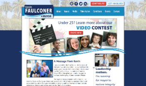
Current City of San Diego Councilmember Kevin Faulconer understands call to action, a critical component when trying to raise funds, manpower, and votes. His website opens with a video “Kevin Faulconer: A Better San Diego” along with buttons to contribute or get involved in the campaign. The website itself lacks white space (an important and often overlooked design rule) and has too many large images and icons fighting for attention. Finally, the main rotating images feature vague, predictable messaging as well as encouragement to sign up for a random video contest at an attempt to crowd source supporters.
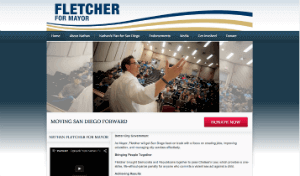
Back for round two, Nathan Fletcher gets immediate bonus points for using our favorite content management system: WordPress. Unlike his competitor Faulconer, Fletcher’s homepage utilizes a little more white space and sleeker imagery. His social media accounts and original blog content are prominent, encouraging users to follow him on Twitter and read up on campaign developments. The only strike against Fletcher is his apparent excitement for rotating headshots as homepage images. Instead of progressing slowly left to right, photos quickly pan in and out from the top, bottom, and sides. Additionally, the images lack any messaging and are only photos with Fletcher as the centerpiece.
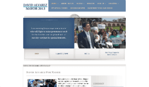
While arguably the underdog in this mayoral race, Alvarez wins a gold star for his homepage. Refreshing white space, friendly images, and easy navigation. It still has its amateur web design and development flaws – the top navigation is cramped next to his (very sad) campaign logo and some website buttons need better design integration – but at first glance a job well done. If just a little more attention was given to the development, this homepage could win the race.
While each candidate’s homepage has their pros and cons, we’ll await for the results to see which individual inherits the clunky, I mean, coveted, SanDiego.gov/Mayor.