You only have a matter of seconds to engage website visitors and gain their trust in your brand. It takes less than 1 second for humans to form a first impression about a person and B2B websites are no different.
When B2B websites aren’t designed with purpose and ease of use in mind, visitors often get frustrated and leave. Below are 3 crucial design elements that will help you leave a lasting impression, establish credibility, and increase revenue.
Clear and consistent navigation
Complex or inconsistent navigation in B2B web design frustrates users because they are not able to easily find what they need on a website. Things like too many product or service offerings, inconsistent categories, and poor layout hurt conversion rates.
For example, too many service offerings, or confusing category options in your navigation can actually make it more difficult for consumers to choose. Psychologists call this “choice overload” or “overchoice.” As the number of choices increases it then peaks and people tend to feel more pressure, confusion, and potentially dissatisfaction with their choice. When you pare down your website menu items to the essentials, you greatly reduce anxiety and doubt for users by giving them clear, easy choices.
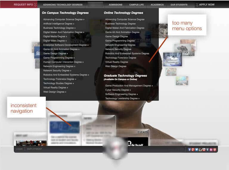
The layout of your B2B website navigation is also one of the most important aspects of the user experience. The primary objective of navigation on a website is to facilitate wayfinding. If your menu moves around and is inconsistent, it makes it hard for users to find the information they need on the website. Users need to know at all times: “Where am I?,” “Where have I been?” and “Where can I go?”
Professional imagery and color scheme
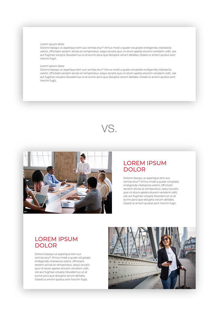
Human beings tend to be visual creatures and, as such, visitors decide quickly what they think of your B2B web design. Language takes longer for our brains to process, so while content is important, when it comes to first impressions imagery is king.
Photos, video, and color should aid and engage users. There are tons of options these days for images and graphics. Whether you use stock or custom graphics, make sure your imagery reinforces your brand story and messaging.
Discover how design impacts your daily life.
Another thing to keep in mind is image quality. Pixelated images feel second-rate, and cheap—leaving this impression. Imagery should be optimized to display well for every digital format and pictures should be crisp and clear.
The color scheme for your site is also important as color is another way to reinforce your brand and messaging. The color scheme of your website should complement your logo, photo choices, and messaging. Studies have revealed that our brains prefer recognizable brands, which makes color incredibly important when creating a brand identity. Your color choices can set you apart or help gain trust by being similar to others in the market.
Check out our favorite B2B web designs.
Visual Hierarchy
A website’s visual hierarchy is also a critical design element. Typographic hierarchy is a system of organizing type that establishes an order of importance within the content, allowing the reader to easily find what they are looking for and navigate to relevant content. Visual hierarchy helps guide the reader’s eye to where a section begins and ends, while also enabling the user to isolate certain information based on the consistent use of style throughout a body of text. Designers use size, placement, and color to help viewers know where to look first.
When you cram content onto a page with no visual hierarchy, the user has trouble discerning what information is most important and will become tired and frustrated when navigating through a site.
Bringing order to chaos is what typographic hierarchy is all about. Size, color, position, and typeface—these are just some of the attributes you can experiment with to create a typographic hierarchy in B2B web design.
The design is not just what a website looks like and feels like. The design is how a website works.
By keeping these design elements in mind, you can create a beautiful and easy to use B2B website. Making this extra effort in the design department will pay-off as you will have better conversion rates and increased profit.