
As someone who’s watched the digital space evolve over the decades, I remember when mobile-first indexing started gaining traction around 2016. As smartphone use skyrocketed and mobile searches overtook those on desktop, it was only natural for Google to start prioritizing the mobile version of websites. By 2018, that shift became official—Google started using mobile content as the primary source for indexing and ranking, completely changing how we approach B2B web design and SEO.
What mobile-first indexing means for B2B websites
This shift requires designers, marketers, and developers to rethink how they build and optimize B2B websites by placing greater emphasis on mobile performance to maintain strong search rankings.
Although the shift to mobile-first indexing isn’t new, it’s surprising how many companies still haven’t fully adapted. To stay competitive and visible, your B2B website must be built with mobile-first best practices in mind.
Here are six must-haves for any B2B website looking to rank well in today’s mobile-first world.
1. Implement responsive design
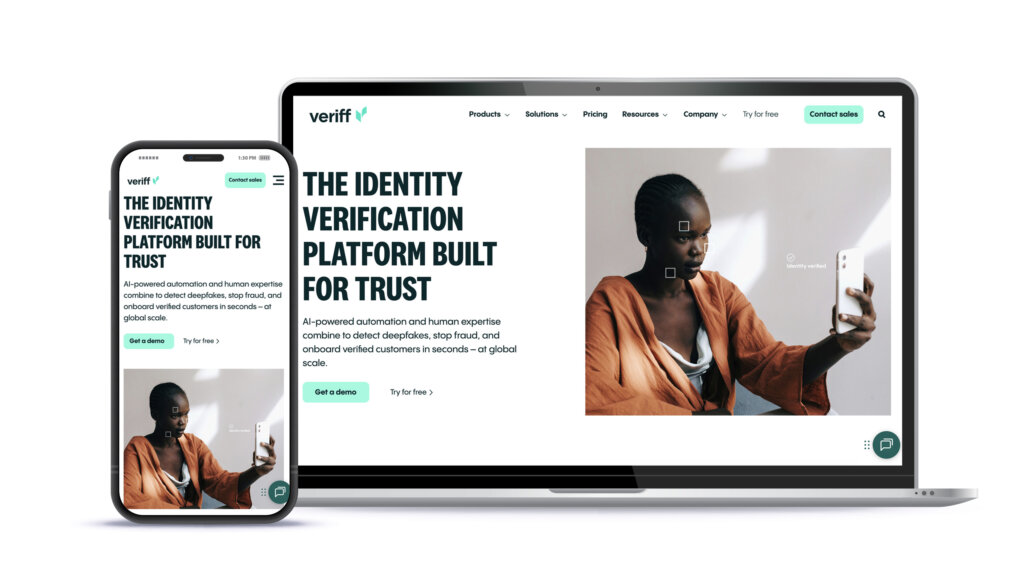
A responsive design is crucial in website design because it ensures your site looks and functions well across all devices. To ensure your layouts adapt fluidly to different screen sizes, use flexible grids, media queries, and scalable assets.
A flexible grid system
A flexible grid system is essential in responsive web design because it allows your layout to adapt smoothly to different screen sizes and devices without breaking or becoming unreadable. Instead of using fixed widths (like pixels), flexible grids rely on relative units such as percentages or fractions. This approach enables content to scale proportionally as the screen size changes.
Media queries
Media queries play a key role by applying different CSS rules based on the device’s screen size, resolution, and orientation. This allows for the adjustment of fonts, images, and layout structures so that content remains readable and visually balanced, whether it’s viewed on a phone, tablet, or desktop.
Scalable images
Equally important are scalable images. Images should be optimized to load quickly and scale appropriately without losing quality.
When used together, these three elements form the foundation of a responsive design that delivers a consistent and user-friendly experience across all devices.
2. Prioritize page speed and performance
Prioritizing page speed and performance for a mobile-first indexed B2B website begins with optimizing how efficiently your pages load on mobile devices. Performance optimization includes compressing images to strike the right balance between quality and file size, minimizing CSS and JavaScript to reduce overhead, and implementing lazy loading so non-essential content only loads as users scroll.
Another key strategy is leveraging browser caching, which allows a user’s browser to store static files—like images, stylesheets, and scripts—locally. By reusing these files on return visits instead of downloading them again, your site loads faster and reduces demand on the server.
3. Content consistency across devices
The mobile version of your website should contain the same primary content as the desktop version to avoid missing key information during indexing. If important content (like key text, images, headings, or structured data) is missing or reduced on mobile, search engines like Google won’t see it, which can negatively impact your search visibility.
Inconsistent content between mobile and desktop can also confuse users and hurt their experience. Many people browse on mobile first, especially in early research stages, so having a full, consistent experience across devices builds trust and helps guide users through the conversion journey. Keeping both versions aligned ensures you’re not only meeting search engine requirements but also delivering value to your audience, no matter how they access your site.
4. Streamline navigation for mobile users
Effective mobile navigation combines clear menus with thumb-friendly tap targets to ensure ease of use on smaller screens. Features like collapsible menus and fixed navigation bars help maintain accessibility without overwhelming the user. Buttons, links, and form fields should be large enough and spaced out to work well with fingers, not just mouse clicks.
5. Avoid intrusive pop-ups
Intrusive pop-ups are one of the quickest ways to drive visitors away—especially on mobile site visits. When a pop-up takes over the screen and blocks the content visitors came for, it creates frustration and often leads them to leave the site immediately. Search engines pick up on this behavior. High bounce rates and low engagement are strong signals that your mobile experience is falling short, which can negatively impact your rankings under mobile-first indexing.
From an SEO perspective, Google and other search engines have made it clear that these kinds of popups—what they call intrusive interstitials—can lead to penalties because they block access to the content visitors need. A cookie notice or something legally required is fine, but when an email sign-up form takes over the screen before a visitor can even read the headline, it’s too much.
If your goal is to rank well and keep users engaged, the mobile experience needs to be clean, accessible, and free of unnecessary obstacles.
6. Optimize content hierarchy and readability
Optimizing content hierarchy and readability for a mobile-first indexed website means structuring your content in a way that’s easy to scan, digest, and engage with on smaller screens. Organize information with clear headings, prioritize key content near the top of the page, and present text in short, readable chunks.
Clean design, legible typography, and thoughtful spacing also contribute to a smoother mobile experience. The goal is to guide users through your content effortlessly while making it easy for search engines to understand and index your B2B website—ultimately improving both usability and visibility in a mobile-first world.
Key takeaways
At the end of the day, it’s about creating a smooth, focused experience that respects your audience’s time. A clean layout, thoughtful structure, and simple, scannable content not only help visitors stay engaged—they also help search engines understand and index your website more effectively. In a mobile-first environment, good content hierarchy isn’t just nice to have—it’s essential.
Contact us today to discuss your B2B web design project and goals.