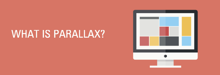
It may sound like something out of a science fiction novel. In reality, “parallax” is a specific type of website design that involves altering the CSS to create a continuous scrolling feature in which graphic elements and text exhibit movement and interact with the scrolling motion. This creates the appearance of a layered visual effect, which helps create depth between the background and the moving images, graphics and text.
If you’re having a hard time visualizing the concept, AWWWards has examples of award winning parallax websites.
Currently, most parallax websites belong to consumer-facing companies, since they tend to be more on the cutting edge of innovative marketing techniques. However, parallax can certainly work for B2B companies. This is especially true with service-related businesses, since the dynamic design tends to hold people’s attention longer, allowing the company to tell a more detailed story. Check out these links for examples of successful B2B parallax websites:
- www.livingword.co.uk
- www.dementialab.org/development-lab
- www.5emegauche.com/#5-mots/digital-native
What’s behind the move to parallax website design?
One of the primary benefits is that parallax design allows a website to walk visitors through a story just by scrolling down the page. This approach works especially well with visitors who don’t like to click on a lot of links or browse numerous pages to get the content they seek.
Parallax design also enables companies to project a unique image that makes their website stand out from others. The dynamic communication style holds the attention of viewers longer than a regular site, and appeals to a younger crowd seeking a different user experience. Plus, the more fluid and linear style of communication keep viewers on track, allowing them to absorb more of the company’s brand messaging.
On the other hand, parallax website design has a number of potential drawbacks, especially with SEO.
A parallax site is basically a one-page site, and the single-page design makes it difficult to optimize the site for a wide variety of search terms. A one-page design also limits you to only one set of meta data for the site. Which means there’s only one way for customers to find you on the web. With multiple-page sites, people can find your site through all the different pages.
SEO experts generally recommend using only one H1 (header) tag per page, and having only one page limits the amount of H1 keywords on a parallax site. Technically, you could cram them all into the one header. But it wouldn’t make sense to readers, and the search engines would suspect something was up.
Another downside is that Google doesn’t like huge pages because they take forever to load. And neither do today’s “I want it now” web browsers. If a parallax page takes too long to load, people will click off and go elsewhere. Analytics can also present a problem, as today’s analytical tools don’t have the capability needed to accurately measure engagement on a single-page website.
Finally, parallax design does not work well on mobile devices, an important consideration given the explosion of mobile web surfing.
If you’re looking for a new and interesting way to engage website visitors, a parallax website design offers a trendy option. It can help your site stand out from the crowd and increase the odds that visitors will take the action to connect with your company. However, if you depend on SEO to drive traffic to your site, you may want to think twice before taking the parallax plunge.