1) St. Louis Rams – Part of having a great logo is having a great mascot and name. If any animal epitomizes the game of football, it’s a Ram. They are strong, dominant, and aggressive. This logo exaggerates the ram horns, which creates an eye-catching design. The team didn’t over do it with the ram’s face – they kept it clean, simple, and compelling. They also playfully use the horns on the helmets of their players – very effective, versatile, and unique imagery. Best Overall!
2) New England Patriots – Growing up right outside NYC, I’m not supposed to like anything related to Boston. But we’re not talking sports in this blog – we’re talking design. How they made a “patriot” look clean, polished, and fierce at the same time is beyond me, but it’s a great logo for a football team. Their logo has come a long way since its original design in 1993. Most improved!
3) Dallas Cowboys – You couldn’t possibly be more iconic and minimal. Everybody knows the blue star represents the Cowboys. It’s in the same category of logos such as Apple and Target. They could have easily tried to go the New England route and illustrate a cowboy or a cowboy on a horse, but they dialed it down to its most simple and representative form. This allows them to slap that Blue Star on just about anything, helping to build more brand awareness than any other NFL team – they are “America’s Team.”.
4) Seattle Seahawks – One of the newest logos in the NFL, the Seahawk icon is sleek, contemporary, and packs a bold color palette. The bright green contrasts nicely with the navy, helping the player standout on the field. The only concern is that the logo is too trendy and may not have the staying power of a logo like the Dallas Cowboys have. Nonetheless, out of all the bird-related NFL icons, this one it at the top of my list for its uniqueness.
5) San Diego Chargers – The San Diego Chargers probably have the most non-descript name in football (right after the Cleveland Browns) but they’ve overcome that with a simple, yet powerful icon. The NFL is full of logos representing animals and inanimate objects, so the bolt represents energy, power, something intangible. The top 5 things that make a good logo – uniqueness, versatility, simple, timelessness, and consistency – the bolt has them all.
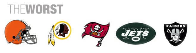
1) Cleveland Browns – Your logo is a football helmet? Seriously, could you possibly be less creative?
2) Washington Redskins – In an era of political correctness, it’s probably time to change the logo. Your name elicits bigotry – do you really need to spell it out for everyone?
3) Tampa Bay Buccaneers – The name is cool, the execution of the logo is terrible. It’s way too much detail – there is no focus. There are three swords, a football, a red flag, and a skull. I think someone forgot to add the kitchen sink.
4) New York Jets – BORING! I don’t know what else to say? If you are going to have an all text based logo – keep it minimal and stylized (like the New York Giants or Green Bay). It’s too hard to read and doesn’t have any personality.
5) Oakland Raiders – Let me start by saying that the Raiders have some serious brand/fan loyalty, proving that your brand isn’t just about a logo – it’s about the entire experience. I think the Raiders logo has good intentions, but it’s time for an update, something sleeker and meaner looking. This logo is experiencing the same issue the Buccaneers have: too much detail, not enough focus. What exactly is this logo depicting anyway? A pirate with a hoodie on or a knight whose eye got compromised in a joust?
If you liked this blog post you may also like these resources: