Tonight’s Iowa caucuses are the first official candidate showdown in the 2016 Presidential Race. Whether you are a Democrat, Republican, Libertarian or Socialist – the 2016 Race to the White House has been nothing short of entertaining. While candidates are spending hundreds of millions of dollars on traditional media, the foundation of their communication efforts is their digital presence. In fact, eMarketer predicts the digital ad spend will reach $1 billion this election.
The centerpiece of any digital campaign is the website. So let’s take a look at the top contenders in each party and see who has the most effective website as a presidential hopeful. We’ll analyze pros and cons and elect a winner based on website presence alone. We’ll primarily be looking at design, content and usability.
Hillary Clinton
Neutral
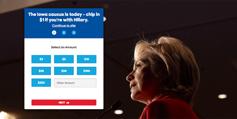
- Visit Hillary’s website today and you’ll find an appropriately-timed call-to-action (CTA) to make a donation. The full landing page is definitely an aggressive tactic that I’m sure will prompt donations, but could potentially turn off visitors looking to learn more about Hillary’s position on the issues.
Pros:
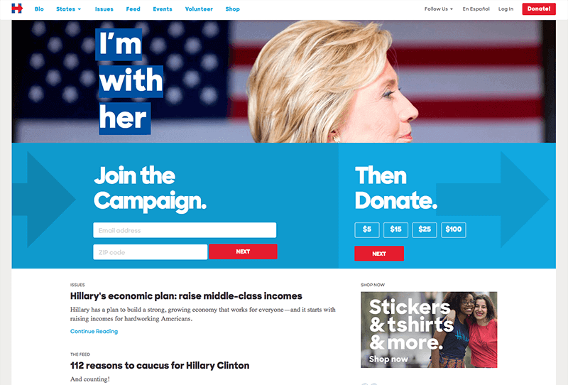
- I’m a fan of Hillary’s campaign logo – it’s clean, contemporary and appropriately represents her progressive political agenda. Those brand elements are nicely carried over to her website, creating a look and feel that is undeniably “Hillary.” Thank you for not using standard stripes and stars.
- There is no guesswork about what the campaign wants you to do when you get to her website. The website boldly and clearly asks the user to “Join the Campaign” and “Then Donate.” It’s definitely aggressive, but necessary with Bernie nipping at her heels.
- Right below the top section, there is a selection of articles touting her accomplishments and reasons to caucus for her. Good use of content hierarchy.
- Her website is easily accessible in Spanish.
Cons:
- Hillary is the only candidate whose campaign website I’m reviewing that doesn’t have a tagline. Taglines are a great way to keep you top-of-mind and quickly communicate what you stand for. Hillary has been accused of pivoting on issues and generally being elusive with the media, so I can’t say I’m surprised she hasn’t committed to a single, bold tagline.
Bernie Sanders
Pros:
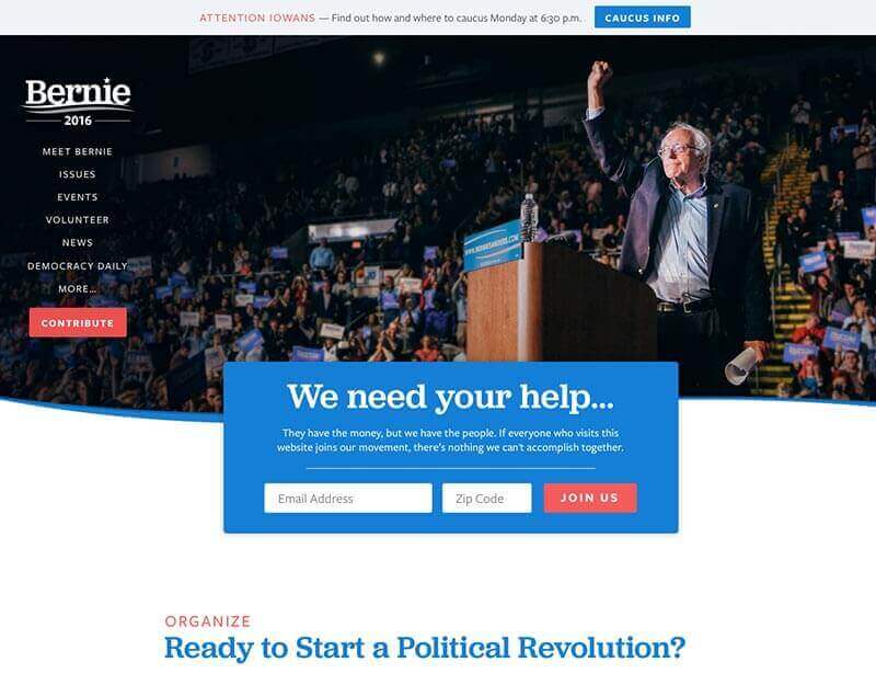
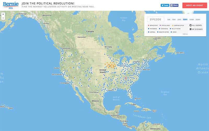
- Bernie may be the oldest candidate in the race, but you wouldn’t know it by his website. It’s super clean and full of engaging content. In particular, his “Join a Live Event” page powered by a Google map is something I didn’t see any other candidate do. The page showcases his grassroots efforts and immediately engages a user to join his movement.
- Bernie’s direct and compelling vernacular on stage is carried over to his website. With lines like “Ready to Start a Political Revolution?”, “Are you Ready?” and “They have the money, but we have the people…” clearly define Bernie’s mission and compels a user to take action. My favorite is his footer “Paid for by Bernie 2016 (not the billionaires).”
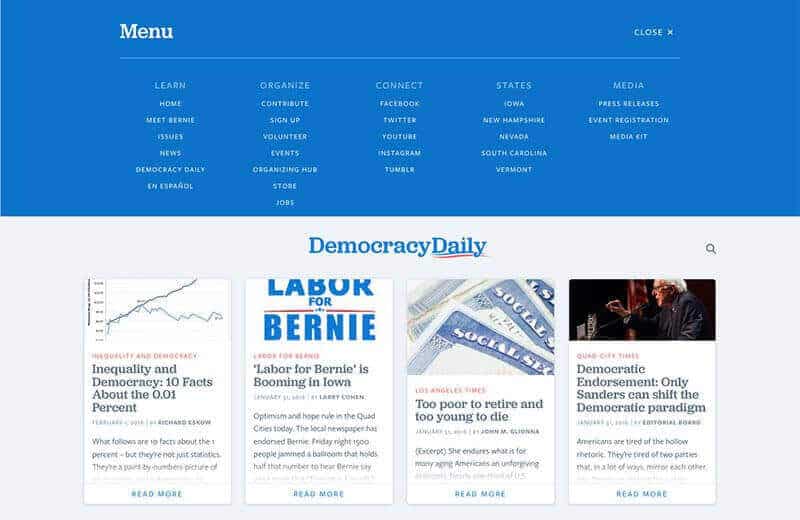
- The “DemocracyDaily” page is a nice addition, compiling articles from various sources that his supporters would be interested in.
- The user-friendly navigation clearly directs visitors to the most important pages. The navigation also allows visitors to easily access more content by clicking on “more,” which brings down a cleanly designed mega menu.
While all the candidates’ websites are blue and red, Bernie has taken an edgy approach using a bright blue and muted red, creating a look and feel that is much brighter and cleaner than the other candidates’ websites.
Cons:
- I can’t really find anything.
Donald Trump
Pros:
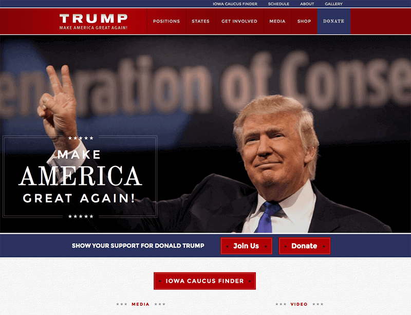
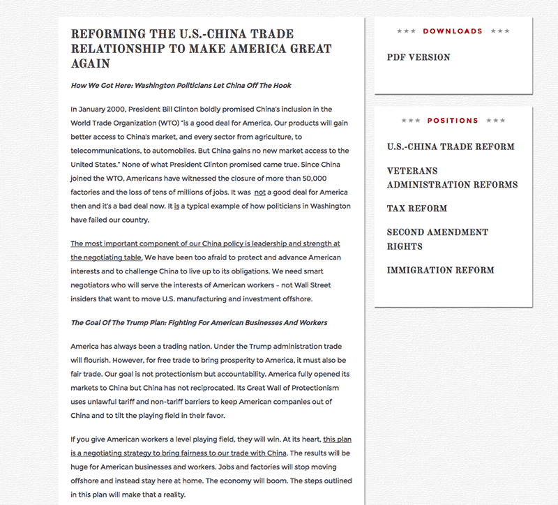
- Donald Trump is the only candidate out of the 5 we are reviewing that uses the term “Positions” in his main navigation instead of “Issues.” It’s an interesting use of words that I’m not sure is intentional or not – nevertheless it sounds more solutions-oriented than the other candidates.
- Trump has one of the most memorable taglines for his campaign and he makes to sure he puts it everywhere when he is campaigning (even his hat)–the same is true for his website. “Make America Great Again!”
Cons:
- The website is clean, but it’s not quite as engaging as some of the other candidates’ websites. There is limited use of photography and other media on the subpages that would likely encourage a user to spend more time on the website.
Ted Cruz
Pros:
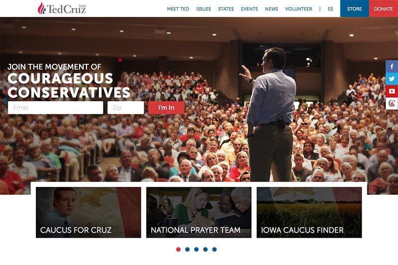
- Whether you like Cruz or not, the copy is very compelling on his website. Lines like “This is the Day, This is our Time” or “Join the Movement of Courageous Conservatives” evoke emotion and prompt action.
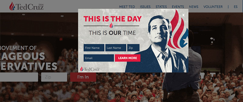
- He too has an appropriately timed CTA, but it’s a pop-up. The pop-up can be easily closed, so a user can get to the main website content sooner.
- He is the only candidate that doesn’t have his face front and center on the hero image. It’s his back talking to a crowd, which is a nice change. It indirectly sends the message that the campaign isn’t about him, it’s about the people. The same is true throughout the website.
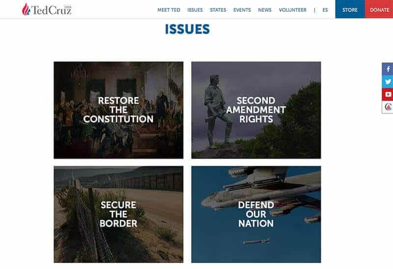
- Good hierarchy of information. Content is broken up into manageable, digestible bits of information which allows the user to easily scan and find what is most compelling to them.
- Out of the other Republicans, Cruz’s website is the only one easily accessible in Spanish.
Cons:
- Nothing in particular stands out.
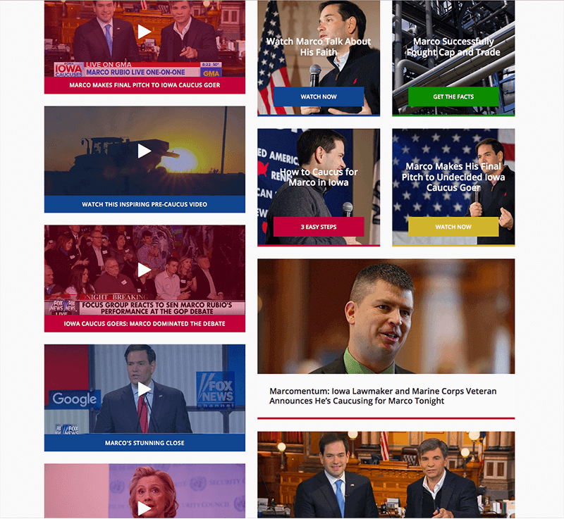
Marco Rubio
Pros:
- I think his “Policy for You” section on his Issues page is smart. It’s not just a list of the issues he’s fighting for, but the people affected by the issues. I didn’t see any other candidates do this.

Cons:
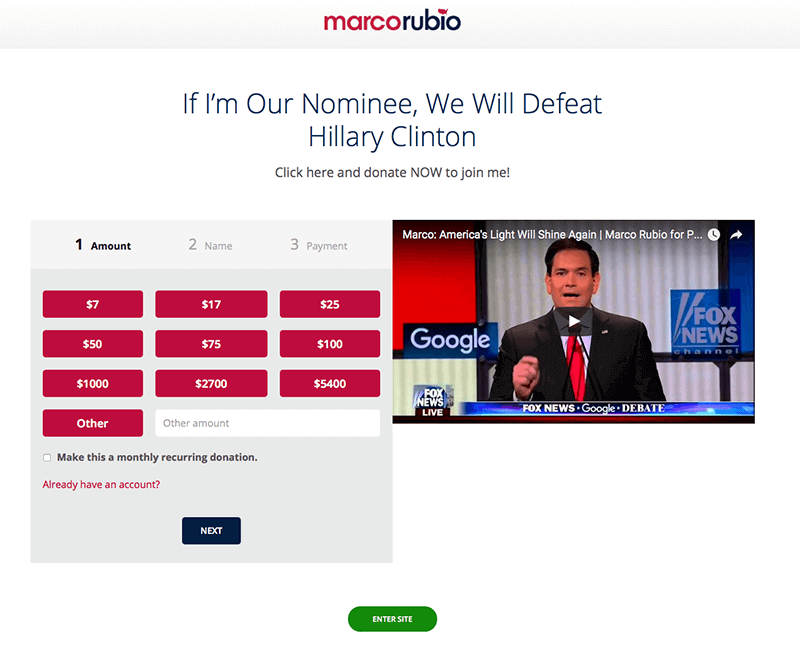
- Rubio is taking a note from Hillary’s website with an aggressive landing page requesting a donation, but it’s not done with the same grace or confidence. First his message “If I’m Our Nominee, We Will Defeat Hillary Clinton” irks me because I don’t want to hear about the other candidates when I’m on a candidate’s website. I want to learn about the candidate whose website I’m visiting. Second, the predetermined donation amounts are strange at $7, $17, $5400, etc.
- A good home page should tell a story and guide the visitor to areas of the website that are of most interest to them. Minus the initial CTA which is somewhat vague, Rubio’s home page is inundated with information – I’m not sure where to go or what to look at so I just leave.
- Marco Rubio promises to be the candidate for the “New American Century,” but his website presence definitely does not position him as a cutting edge candidate.
- Rubio has a broken link to his store – yikes!
And the winner is…
Based on this very “scientific” review, Bernie Sanders is the Democratic winner and Ted Cruz is the Republican winner of the Bop Design 2016 Presidential website showdown. Both websites share three core characteristics that make them winners.
- Bold, clear brand messaging
- Clean, user-friendly design
- Engaging, educational content
These characteristics are universal to the success of any website and a winning marketing strategy.