
There are many things to consider when building a successful B2B website to attract and convert visitors into potential clients. However, the foundation of a successful website is the user experience (UX) of your website.
The UX of your B2B website shouldn’t be an afterthought, but the guiding principle of your web design. Let’s look at how you can boost the UX of your B2B website and improve conversions:
1. Easy to use navigation
Before a website visitor can complete a form or download a guide, they need to be able to navigate their way around your website design. For this reason, it’s essential to have clear, easy-to-use website navigation.
Consider the following when designing your website’s navigation:
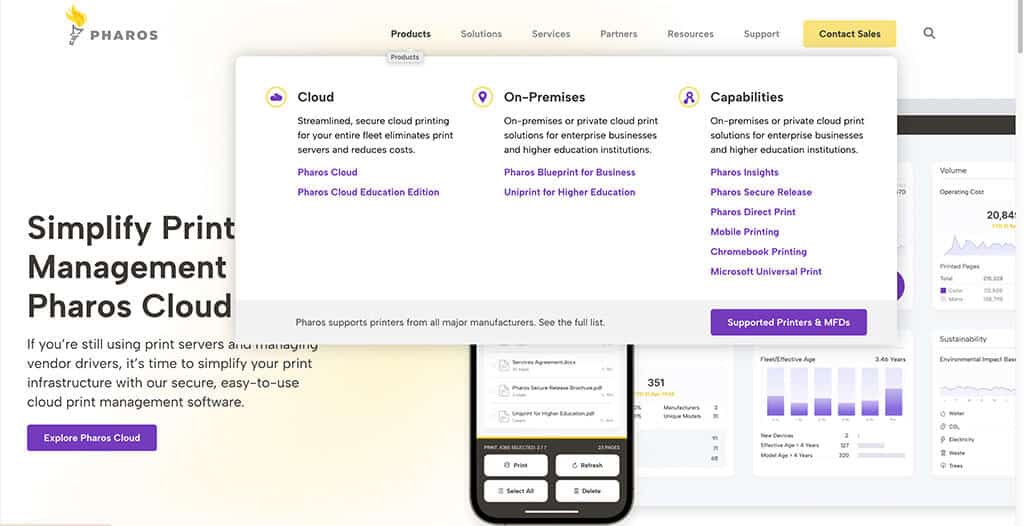
- Create a menu that is well thought out and lists products and/or services in an easy-to-understand manner. Avoid providing too many options, as this can overwhelm the user and cause them to freeze or leave your website. We designed a website for Pharos that clearly organizes their products, solutions, and services in the website navigation. While they have a lot of options, we elected to nest the options in the navigation and include icons to back up the headers. Doing so gives the user a clean visual that is organized and provides visual clues as to the different sub-categories.
- Layout the navigation so the user finds themselves and what they need. The navigation is the first time the visitor sees what your firm’s offerings are and who you work with. The user wants to see themselves and think, “they are talking to me.” The navigation needs to be properly sorted so it makes sense to the user, which can be different than how you view the services internally. For example, on the Haskell & White website, the sections under “Who We Serve” are broken up by industry and company type. While there may be some cross-over between the two, splitting them up in the navigation enables the user to see not only the industries the accounting firm serves, but also the types of companies they work with in those industries.
- Make it mobile-friendly. Be careful when crafting the menu to avoid including anything that won’t translate to mobile. Think about how it’s going to look nested on the user’s phone. For example, mega menus often have a click and drop down with organization that makes sense. Things like hover, click to view more, and nesting ensure the functionality is there without overwhelming the size of the mobile screen.
See more insights on website navigation best practices for a smooth UX.
2. Engaging content
Engaging content on a B2B website design is a careful mix of helpful information that is not too in-depth. When you truly understand your website visitors and what they need, you can craft content that provides the information they need, resources for additional information, and the path to get in touch.
When drafting new content for your B2B website, think about the following:
- Creating user content is a bit like the Goldilocks tale – you want to provide content that informs the users just enough and is not overwhelming or underwhelming. Well-crafted content allows the user to dig deeper, if they should so desire but doesn’t shove a wall of copy in their face. It’s important to remember that the attention span of most users online is short, so all web copy needs to be succinct, while also informative. Since website copy affects the design, keeping it short is more engaging and enjoyable for the end users.
- Write content that is targeted to specific markets so visitors recognize that you can help them and have experience working with similar types of companies. Again, you want them to think, “this is for me, I see myself in this.” If a user sees too much copy on a website or doesn’t get any indication of who it’s intended for, they often assume the brand isn’t professional or savvy about their target audience. While your content should be educational, avoid overexplaining or writing too much copy. Content should appear confident and direct – which, admittedly, takes practice and often requires a professional copywriter to get it right.
- Use a tone of voice that is authentic to your brand or company. The personality of your B2B website that comes across in the content must match who the company is and what it stands for. For example, don’t write copy with a playful tone if your company is considered no-nonsense and don’t write dry copy if your branding is light-hearted and funny.
3. Professional B2B web design
The overall visual look of your website can either provide a pleasant experience for the user or can cause distrust or skepticism about your company’s offerings. It’s important to have a polished, professional website design that accurately reflects the branding and values of your company.
When we talk about professional B2B website design, here is what we mean:
- The design should draw on a pleasing, contemporary color palette. Don’t use colors that are visually jarring or hard to look at.
- Incorporate easy-to-read fonts throughout the website. While a certain script may look great on a tattoo, that doesn’t mean it will translate to a full page of website copy. We recommend using one of the tried-and-true fonts. The right font choice for your website will have good readability and present a modern, clean design.
- Ensure content is organized into easy-to-digest sections. Our creatives think in terms of modules on a website page, and we lay things out in sections. Doing so, keeps content and visuals short and sweet – and easy to view and understand.
- Include interactive elements to engage users. These types of elements include videos, moving carousels, and responsive tools. The goal of these elements is s to get users to come back to the website and convert when they are ready to start the conversation with your business development team. Creating valuable tools, like ROI calculators and glossaries, also positions your firm as a leader in the industry.
Check out this article for more tips on making your B2B website more engaging.
4.Strong calls-to-action
Providing helpful content and clean visual designs is a great way to keep users on your website, but what’s next? Using strong calls-to-action (CTAs) on your B2B website guides the visitor along and tells them what the next step is for them.
When building out strong CTAs or evaluating your existing CTAs, think about:
- Whether your CTAs provide clear prompts to “contact,” “download,” “sign up,” or “get a demo.” Make sure your CTAs aren’t nebulous or unclear. If your brand has a cheeky feel, draft a CTA that is true to the brand – like “let’s chat” or “say hello.” All CTA terminology must be action-oriented and positioned as a directive – tell them what to do. Keep it straightforward and simple – don’t overexplain what they need to do.
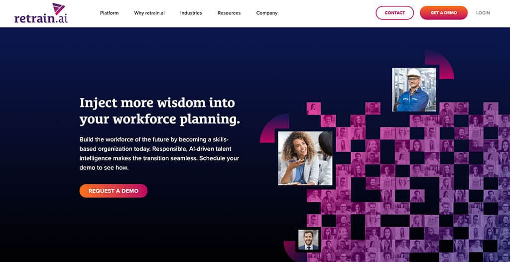
- Consider if your CTAs are easy to identify or find. Always use bold colors, big font, and direct copy. Use short headlines that grab the user’s attention. Make the CTAs easy to complete. On the B2B website for retrain.ai – a leader in the AI talent intelligence space, the CTAs are easy to find, have a nice color contrast, and tell the visitor exactly what will happen when they click on the CTA.
Looking for CTA inspiration? Check out this article for CTA ideas.
5.Proof or validation that you are the best choice
You know your firm is the best, but how do you communicate that to users on your B2B website? You can’t simply state, “We are the best/top/#1” anymore and expect website visitors to believe you. Rather than telling the user you are the best, you must show them why.
Here are a few tips on how to give proof that your company is the best option for the website visitor:
- Leverage case studies that show the value of your products or services. Highlight these on your website by showing data or statistics clearly in the design. A great way to do that is by pulling out the numbers and creating a visual with those numbers while linking it to the case study. Showcasing the data as big, bold numbers in the design pushes the user to read more and see the full story.
- Let your clients tell prospects what it’s like to work with you. Create a testimonial section for third party-validations. These testimonials build instant credibility, especially when they include company and client names.
- Testimonials are valuable, but video testimonials are priceless. Showcase video testimonials prominently with the ability to play on the page. Being able to see the client providing the testimonial and hear it exactly as the client states his or her experience is almost as good as talking one-on-one with the client.
- Be your company’s hype person by highlighting wins. Display statistical wins with big bold type to prove to users that you know what you are doing and it’s worth the investment. Using the data in visuals draws in the user, backs up the claims you make on your website, and provides that “wow factor.” The bit central website leverages big wins with a scrolling ticker near the top of the website. This draws the user’s eye and demonstrates that they are good at what they do.
The key to a great user experience (UX) is focusing on the user
This might sound like common sense, but it can often get overlooked in all the decisions required to build out a new B2B website. However, if you keep a close eye on the five areas listed above, your website will look professional and create connections with your target audience.