Not every B2B logo is the same, but great business-to-business logos do have similar attributes. Great B2B logos are all designed with six key aspects in mind: clarity, usability, legibility, uniqueness, color, and simplicity. Before you start the process of B2B logo design for your firm, it’s important to understand the anatomy of a great logo.
Before we jump into what makes up a great logo, it’s important to understand the two different types of logos. There are logos that include a wordmark and a symbol (ex. Microsoft) and there are logos that are just the name of the brand, also known as a logotype (ex. CocaCola). Typically, for B2B logo design, it’s best to include a wordmark and a symbol, especially if you are new to the market.


Clarity
When it comes to logos, they must all accurately and clearly reflect the firm’s brand. For B2B firms in particular, the clarity of the logo is vital to all marketing and branding efforts. The logo needs to be clearly identifiable to the right audience. Also, it must clearly tie back to the brand’s core values and services.
Usability
In B2B marketing, the logo is used for a variety of applications. A logo is often included on the website, emails, social media, online paid ads, brochures, sales sheets, letterhead, and even on the front of the building. Because of its multi-usage, it needs to look great big or small and in web and print media. Great B2B logo design takes this into account.
Ex. Nth Generation
The logo we created for Nth Generation is able to be adapted for a variety of purposes without losing any of its integral pieces.
Legibility
It’s no use putting a logo on something if it can’t be read. A logo needs to be legible no matter what size or where it appears. This sounds like common sense, but is trickier than it seems. B2B logos for firms often have an identifiable “mark” in all versions of their logo, which is especially important for firms with longer names. Once the brand and logo have been established, the symbol or mark can step in to take the place of the entire logo.
Ex: Kennedy Speech Communications
The logo created for Kennedy Speech Communications is legible and identifiable. When necessary, like on Twitter, the logo’s symbol stands in for the whole logo.
Unique
There are a lot of great logos out there and it’s easy to want to replicate them. However, to be truly effective, a B2B logo design must be memorable, unique, and original. As a whole, people are highly visual, so a unique visual logo works best for branding purposes.
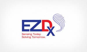
Ex: EzDiagnostix Logo
We created a logo for EzDiagnostix that is unique to the brand, with a custom symbol created for the logo.
Color
As human beings, we react to different colors in different ways. Skilled designers are versed in the psychology of color and often choose colors that will accurately reflect what a brand wants to portray. The color of a B2B logo must relate to the industry as a whole. Additionally, logo colors must not compete with each other. It often surprises people to learn that most major brand logos have only one or two colors (ex. Target, GE, Cisco, Ford).
Ex: Trifecta
The logo designed for Trifecta only uses two colors that are related to the hospital, hotel, and restaurant industries.
Simplicity
A logo does not need to be complicated and intricate. In fact, the best B2B logo designs are simple and neat. A simple logo increases the usability and legibility of the logo as well. It can take several rounds of revisions and feedback to get there, but a great logo is simple and clean.
Ex: IXI Technology
The IXI Technology logo we designed is simplicity in its finest form. The first part of the firm’s name doubles as the symbol of the logo, creating a multifunctional logo that is neat and clean.
When firms come to us looking for new logos, they think the logo can only be boring and conservative. B2B logos don’t need to be boring. The right logo designer can make an exciting and interesting logo by sticking to the basic anatomy of a great logo. Learn more about B2B logo design with our logo design tip sheet.


