A contemporary B2B website is key for any company looking to generate leads online. To help keep your website looking fresh, we’ve compiled the top 5 B2B website design trends for 2019.
While trends tend to organically morph over time, the new year is always a good time to take a look back and determine what’s on the way out and what’s going to stick around in 2019. The 5 trends listed below are particularly sticky and ones that will work well for a B2B aesthetic.
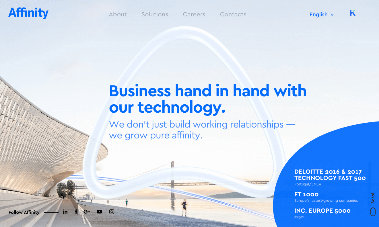
Natural, organic shapes
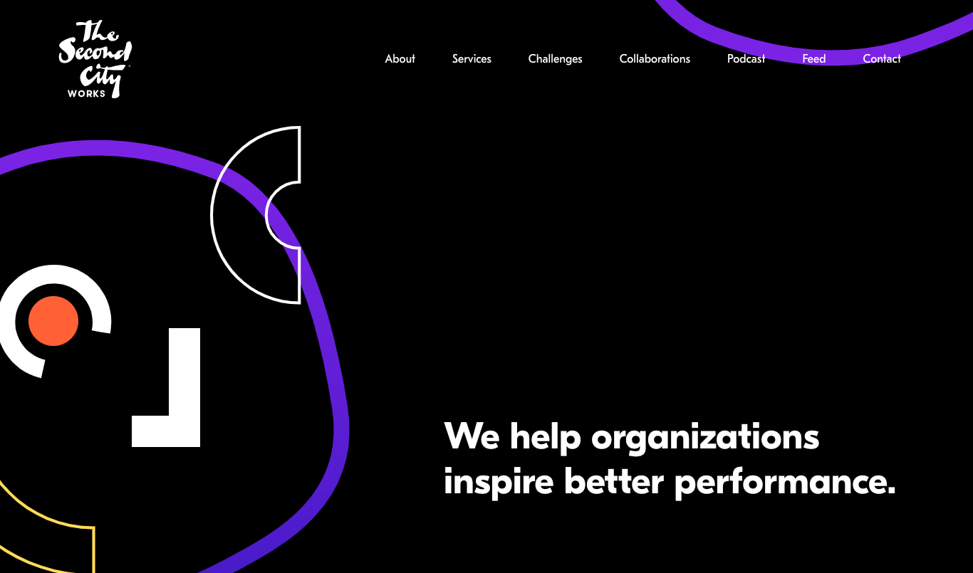
Watch out squares, circles, and rectangles! You’ve got some new competition in town – organic, amorphous shapes. Natural and organic shapes are something commonly seen in consumer brands. However, as B2B brands see the value in pushing the boundaries when it comes to design, we’re starting to see it pop up more frequently.
These shapes are eye-catching and help set your brand apart from the competition. In both the Second City Works and Affinity websites, you’ll notice the use of key organic elements to highlight specific areas of content.
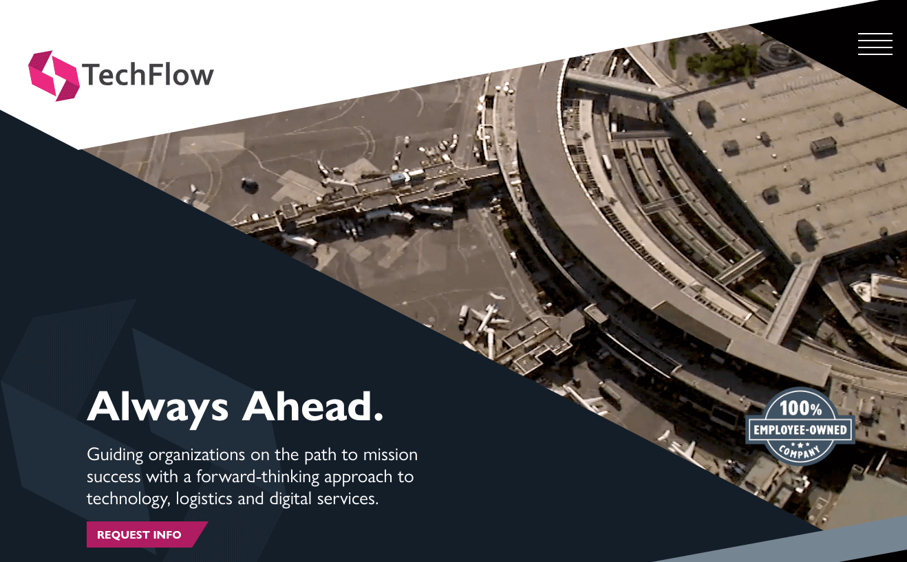
Broken Grid
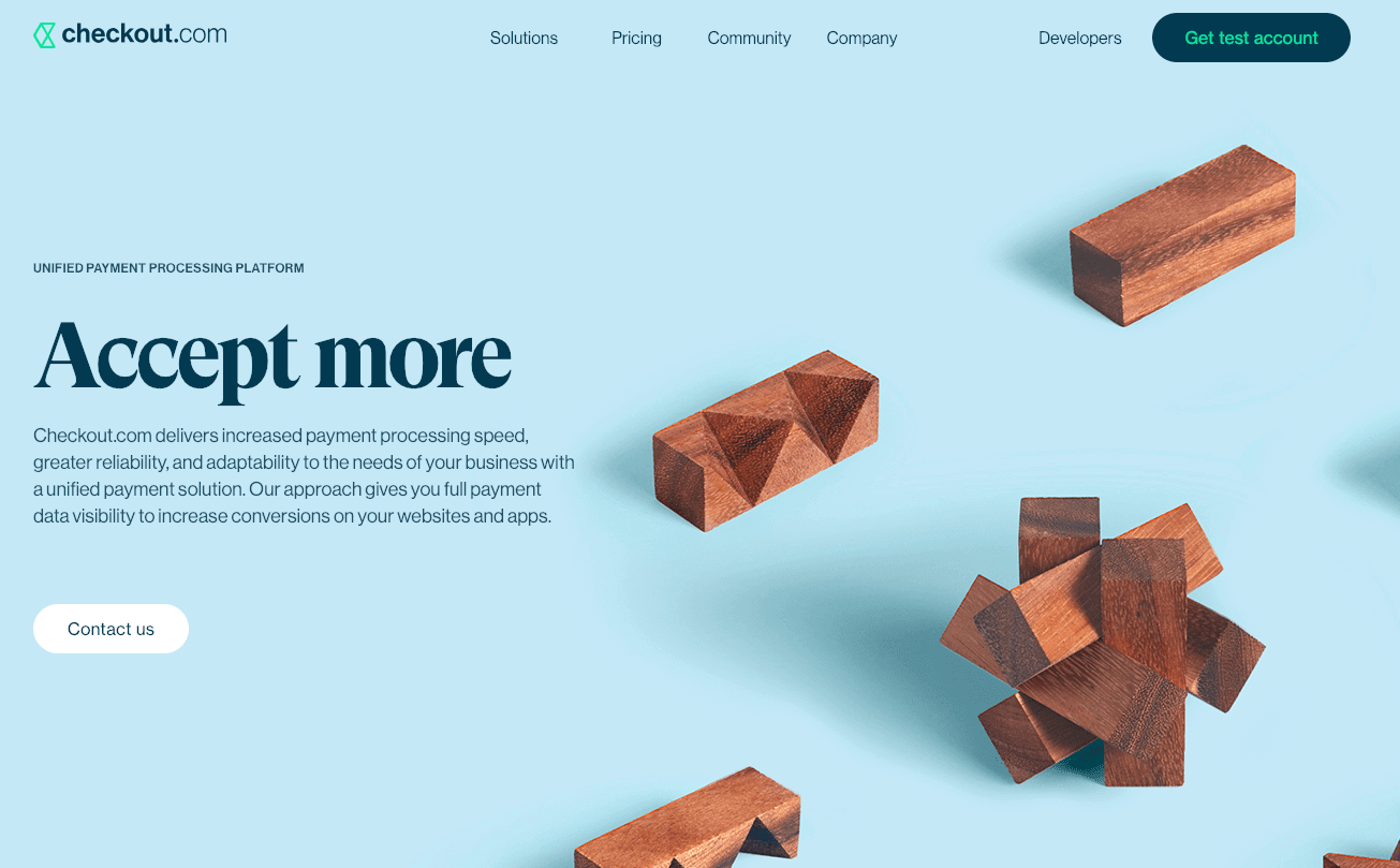
In similar fashion to the use of organic shapes, designers are now breaking from the traditional grid that guides most B2B web designs. More websites are setting themselves apart from the pack by utilizing angles or using asymmetrical grids.
For example, the TechFlow website, launched by Bop Design in January 2019, utilizes steep angles as a core design element, creating an edgy look for their B2G audience.
Likewise, Checkout utilizes a subtle asymmetrical grid, where the photos and content are slightly staggered, encouraging the user to keep scrolling.
Check out our B2B web design FAQ.
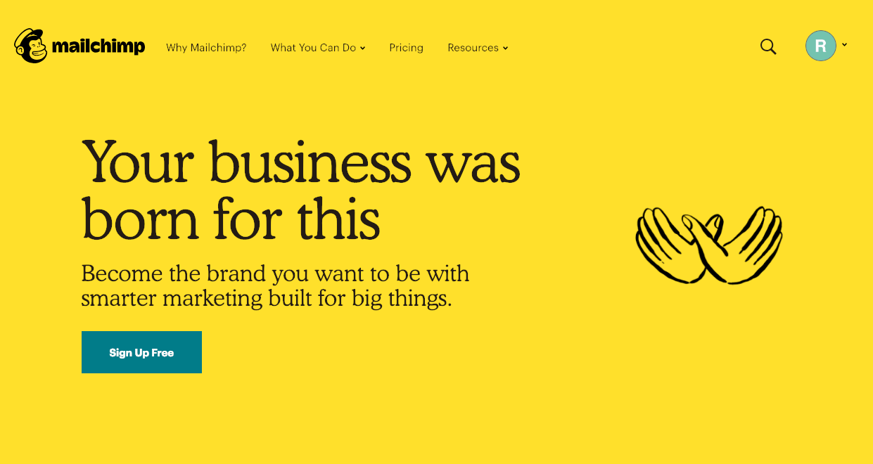
Motion
Video backgrounds have been all the rage for the last couple of years and are not going away. In fact, designers are incorporating more and more motion into B2B website designs, whether it’s animation, video or dynamic scrolling effects.
The latest MailChimp website redesign incorporates some clever animation that has a very organic vibe (they are so 2019!).
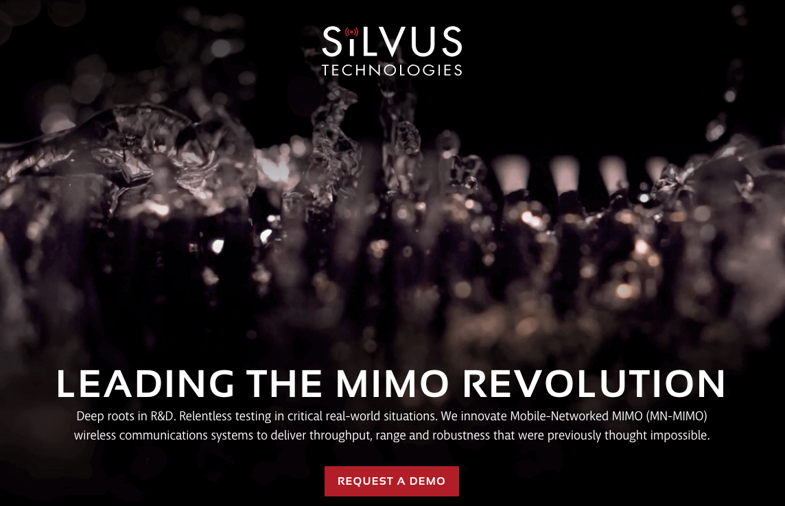
Similarly, the Silvus Technologies website, launched in the latter half of 2018 by Bop Design, effectively utilizes video background to showcase the durability of their products. Whether it’s animation, motion or video – remember the key is to help it support your brand story and user experience.
Minimalism
Less is more is truer than ever in 2019. If I were the Marie Kondo website designers, I would tell you only to keep the content and design on your website that “sparks joy”.
All kidding aside, the users on your B2B website are people and people are tired, overwhelmed, and constantly inundated with too much information. Your website should be simple for them to understand. It should be a place they go to and feel relaxed and think to themselves “this is going to help solve my problems” or “this is exactly what I was looking for”. This is especially true for B2B companies, who often have complex business models, product and services.
Dialing your content and brand messaging down to easy-to-swallow messages are the keys to keeping your user engaged. Likewise, the design should be clean, airy, and only include elements that are absolutely necessary.
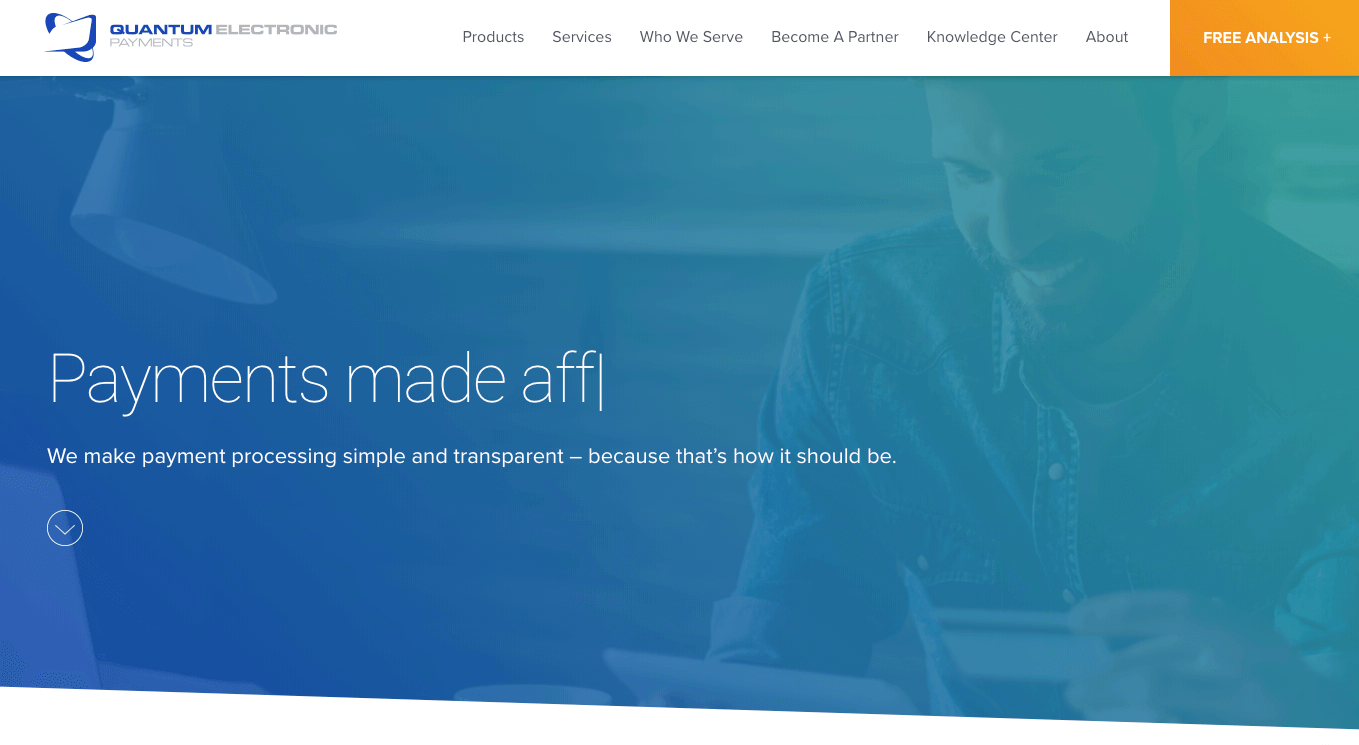
The website for Quantum, launched late last year by Bop Design, helps differentiate them from their competitors efficiently from a design and content perspective.
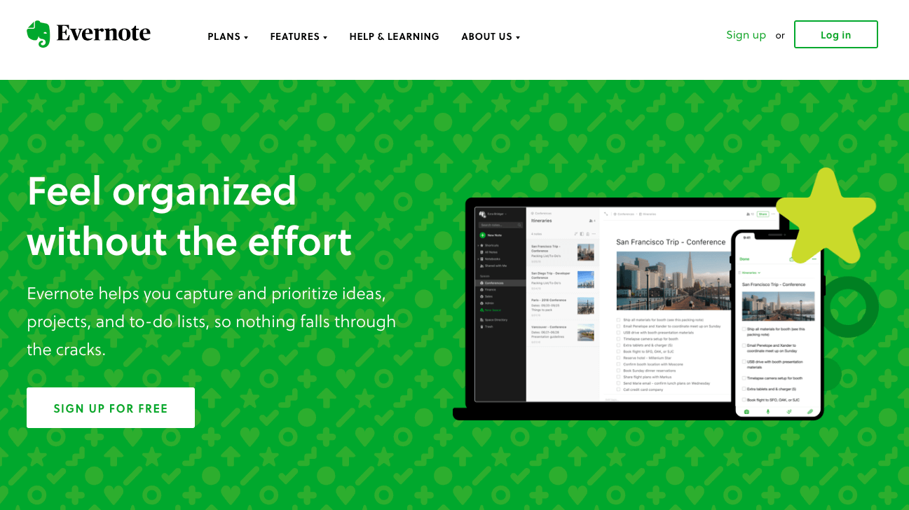
 Evernote achieves the same thing in their latest website design.
Dynamic Scrolling & Micro-interactions
Getting a user to your website is a feat itself. However, once they are there, you have to keep them engaged. Utilizing subtle animations, micro-interactions, and dynamic scrolling is a great way for users to pay attention to certain areas of your website and content you want to highlight.
These are also great elements to use when you have a very minimal B2B website design. By adding micro-interactions and dynamic scrolling, you can add some visual interest without cluttering up the design with unnecessary graphic elements.
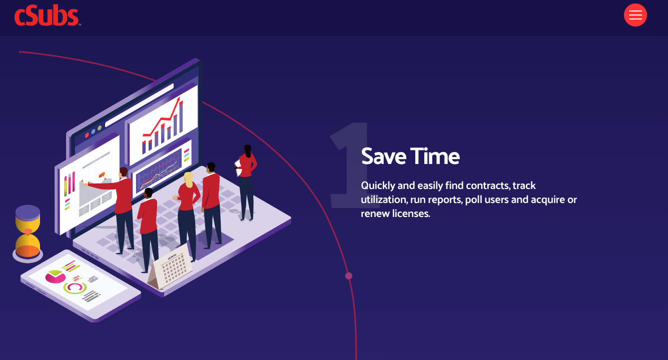
For the new cSubs website, Bop Design used micro-interactions and animation to help explain and highlight the benefits of their software.
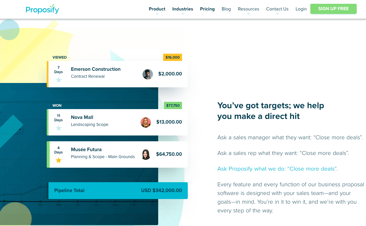
Similarly, as you scroll down on the Proposify website, you’ll notice lots of dynamic scrolling, animations, and micro-interactions that signal a user to pause and pay attention.