In college, I had an amazing typography teacher. Her class was dedicated to teaching us newbie graphic design students about the importance, intricacies, and role of fonts in our world.
I needed this class. I took fonts for granted. A daily necessity for just about everything—I would read things and then get on with my life. I had never taken the time to think about their form, their history and their personalities. Their artful purpose and intent remained subliminal to me until I took this class.
How can a font have a personality and intent? Take a look below and find out.
The above was one of the first exercises we did as design students. It demonstrated how font choice can make or break what you are trying to convey. If your font choice is not in sync with your message, it becomes confusing, hard to understand, and feels like an imposter.
This is a great lesson to apply to your B2B website. Choosing fonts that support your brand message and resonate with your target audience is an essential part of every B2B website.
Below are a few examples of websites that demonstrate excellent font choices and why they work so well.
mPulse Mobile
Font Families: Muli and Lato
MPulse Mobile is a leader in Conversational AI solutions for the healthcare industry. The fonts used on the site are clean and modern—very tech-forward. But, at the same time, they remain very approachable and friendly due to the roundness in their letterforms. These traits reflect both the company and its technology solutions perfectly.
Read more: Easy tips to close B2B website leads.
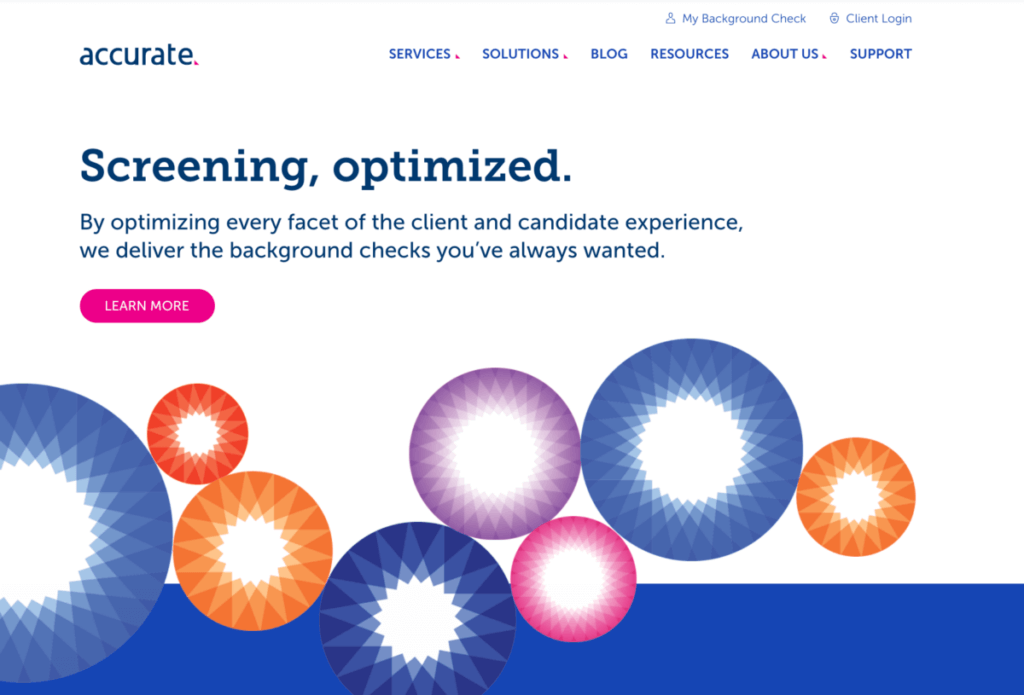
Accurate
Font Families: Museo Slab and Museo Sans
Accurate is a provider of compliant, automated workforce screening solutions. The fonts used on their site are distinct, welcoming, and contemporary in their form. These traits reflect the needs and tone of their main target audience—HR professionals.
Read more: What we love about recent B2B website designs.
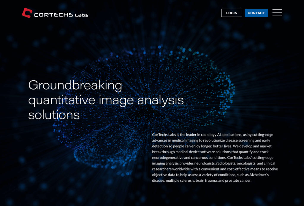
CorTechs Labs
Font Families: AcuminPro and Lato
CorTechs Labs is a leading quantitative neuroimaging software company. Their cutting-edge, life-changing technology calls for a sophisticated well-rounded font. AcuminPro is able to deliver with its versatile sans-serif typeface. Offering a balanced and rational quality to the website.
Read more: Why less is more when designing a website homepage.
The ways words are presented can have a profound effect on how they are perceived by the reader. Make sure your font style aligns with your B2B brand’s character and messaging.


