Time for a close-up. Today, we’ll briefly explore specific design elements and principles that have proven valuable for two of our B2B web design clients.
-
Zeotap – Humanizing Customer Data
The focus for Zeotap’s marketing rebrand was to humanize their robust customer intelligence platform and make their offering both engaging and easy to understand. The following B2B website design elements helped achieve both goals and changed the company image from distant and mechanical to warm and aspirational.
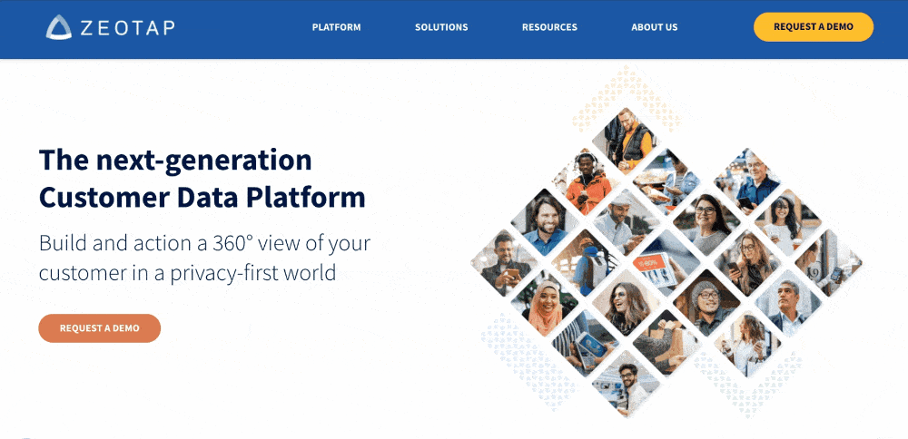
a. Fresh Color Palette & Custom Pattern
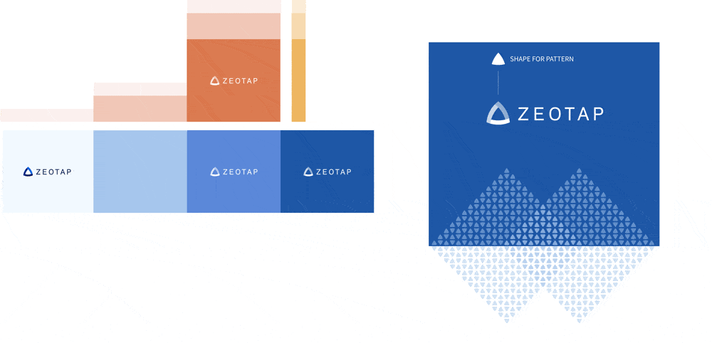
With target audiences in mind, creating an energetic, but not overly saturated color palette was key for this company’s rebrand. The final color scheme included lighter tints of each hue, which encouraged the use of whitespace and color opacities for subtle layering. The final result sets a friendly yet confident tone.
The Zeotap logo inspired the creation of a custom pattern that became a unique and flexible addition to the design. Incorporated throughout the website as an abstract arrow and background accent, the pattern helps this B2B brand stand out from the competition.
b. Candid Photography
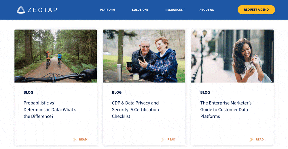
To help humanize the Zeotap platform, candid photography focusing on positive customer outcomes became an integral part of the brand and B2B website design. Stock photography was selected for color, mood, and diversity of subject. The photographs help liven up key sections of the website and are used throughout the company Resources subpages.
Candid photos of diverse individuals were also combined with the brand colors, shapes, and icons to create custom visuals. These compositions help communicate more abstract concepts and support website messaging in a unique way.
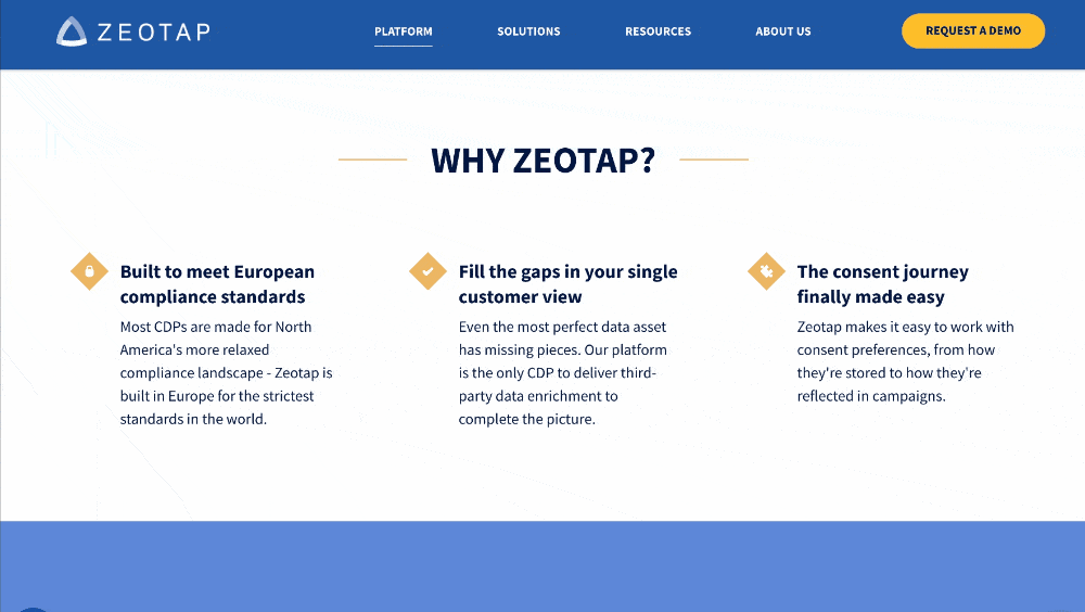
c. Mega Menu
A mega menu is often utilized for larger websites or those with a complex hierarchy of subpages. Such websites benefit from this style of custom navigation, designed for clarity and optimal user experience.
The B2B web design navigation for this client was created to clearly organize subpages into a scannable layout. Utilizing headings and minimal intro copy, this full-width navigation style allows users an at-a-glance overview of the company offering and a quicker way to get where they need to go.
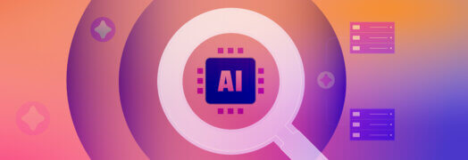
d. Icons and Infographics
Icons help provide a visual anchor for website content and allow visitors to scan key benefits more quickly. A simple and flexible branded icon set was created for this client to maintain visual consistency and to allow icon re-use.
With a complex product offering, it is often helpful to visualize how components relate to one another. In this case, each core component of the Zeotap platform has a dedicated landing page. To help unify the platform as a whole, a single infographic lists each component and allows the user to click through, providing another avenue to dive deeper into the site.
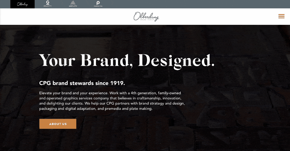
2. Olberding – A Brand Family
Olberding Brand Family needed a company website that not only highlighted the longstanding success of its core brand but also showcased the three distinct branded service lines in a streamlined and modern way. The elements outlined below were some of the B2B web design components that helped achieve those objectives.
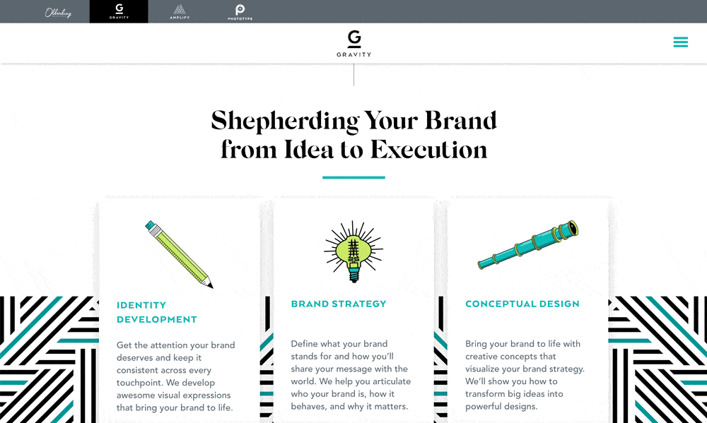
a. Unique Typography & Animation
![]()
Typography choices have a great impact on a website’s overall look and feel. In this case a serif font adds a unique and refined style to large headings. Rather than having just one static headline, the type in the hero section animates to reference the three core services. A subtle looped video compilation in the background helps support the messaging but is intentionally dark to provide the highest level of legibility and focus on content.
Custom logo animations are a differentiator for this client, providing visual interest and communicating a dedication to detail. The centered logo is given room to stand out within the pinned navigation and the placement also works together with the centered line animation used throughout the website to tie sections together as the user scrolls down each page.
Read more: What fonts say about your B2B brand.
b. Tabbed Navigation
The three unique Olberding Brands: “Gravity”, “Amplify”, “Phototype” were given prominence in the top navigation. Each link to their own uniquely branded URL but the site structure and design help tie the brand family together.
The simplicity of the hamburger menu on the right is visually clean but also necessary. Each brand has a unique set of subpages that can be accessed from this side menu and the color change for the menu icon helps illustrate that there is a difference in content between the three brand microsites.
c. Featured Client Logos
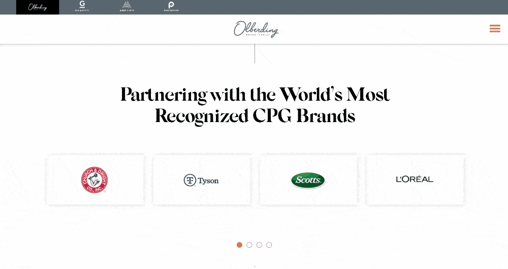
B2B companies that can share client logos benefit from the credibility boost that visual recognition provides. In this design, the type size for the headline statement is prominent and the logos featured are carefully sized relative to one another. Creating a card design treatment like this helps maintain a uniform look for disparate logos, and provides enough white space around each to preserve logo integrity.
In this client’s case, an automatic scroll shows four logos at a time, but such animations can also play one at a time if fewer logos are available. Adding an animation like this helps users understand that there is a large client list but also keeps the design uncluttered. In such cases of an automatic scroll, adding a way for the user to click through is recommended. The secondary buttons allow visitors a way to control the module and pause on logos they want to see.
Key Take-Away
For B2B companies, having a custom website with a focus on solid design translates to increased business performance. Appealing to target audiences visually goes a long way toward building new customer interest, and trust. Successfully combining design elements such as color, graphics, and photos with clean navigation and appropriate use of animation creates a positive user experience that will ultimately help increase conversions.